EPISODE 10: HOW TO ACHIEVE A SOFT FILM LOOK WITH DIGITAL (HINT: IT STARTS WITH THE CAPTURE!)
AN UPDATE (FEBRUARY 5, 2019)
If you’ve found your way here from YouTube I must apologize that this site is in sore need of an update. That’s all coming, along with more current personal projects and longer videos where I just walk you through process stuff – keepin’ it simple and ensuring my amazingly talented husband Derek has time for his projects. 🙂
I have since also tried some amazing presets by an incredible photographer named Rebecca Lily. Her presets are amazing and I’ll soon post how those turned out.
OKAY… BACK TO THE INFO FROM THIS EPISODE…
Today we’re going to compare some of the most popular Lightroom film presets to create a soft-and-airy, fine-art film look with digital images.
THE CAPTURE
Like a lot of you, I love that soft, fine-art film look popularized by photographers like Jose Villa or Elizabeth Messina. And there are countless presets, actions, filters and plug-ins that can help you achieve it.
But here’s the thing: you can’t just throw a preset on your image and expect perfect results. The process has to start within your camera during capture. If you’re going for a more soft and airy pastel look you’ll want to open your aperture wide (ie f1.2 to f2.8) for a shallow depth of field and you’ll want to over-expose by between .5 to one full stop (film photographers will over-expose by two or more stops, but you’ll blow out your highlights if you do this with digital). The pro of shooting an over-exposed, wide-open, shallow-depth-of-field image is that skin almost never needs retouching!
A little note that if you’re going for a more dark-and-moody Gabe McLintock feel to your photos you’ll want to under-expose by around .5 to one full stop.
A NOTE ABOUT GRAIN
Film grain is gorgeous when it’s film… but when it’s applied as an after-effect it can sometimes look a bit fake. If you have a DSLR or mirrorless camera that produces nice grain, then try to achieve your grain within the camera by shooting at ISO400 or higher. You can add grain in Lightroom or Photoshop, but be careful. It may look okay on your screen but not as good in print.
THE SHOOT
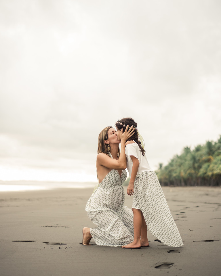
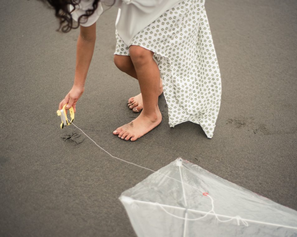
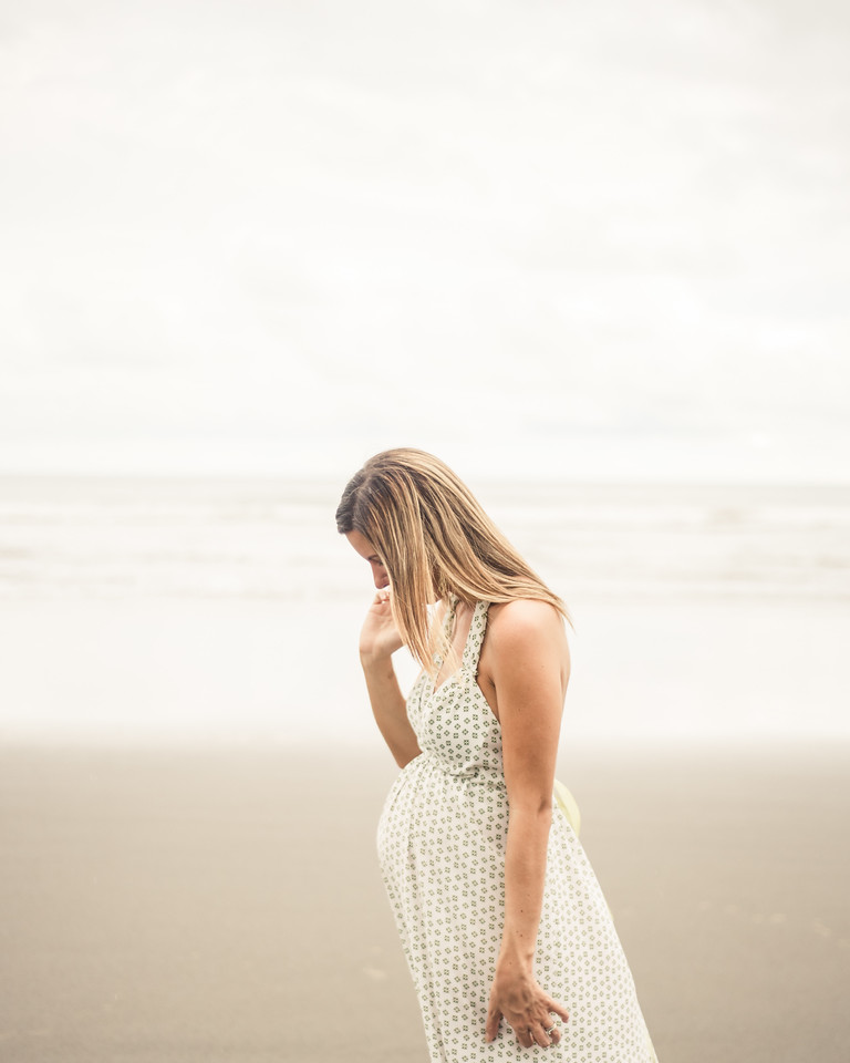
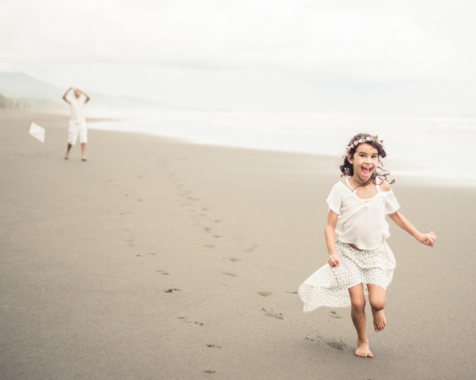
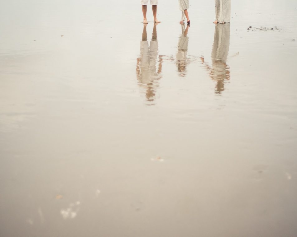
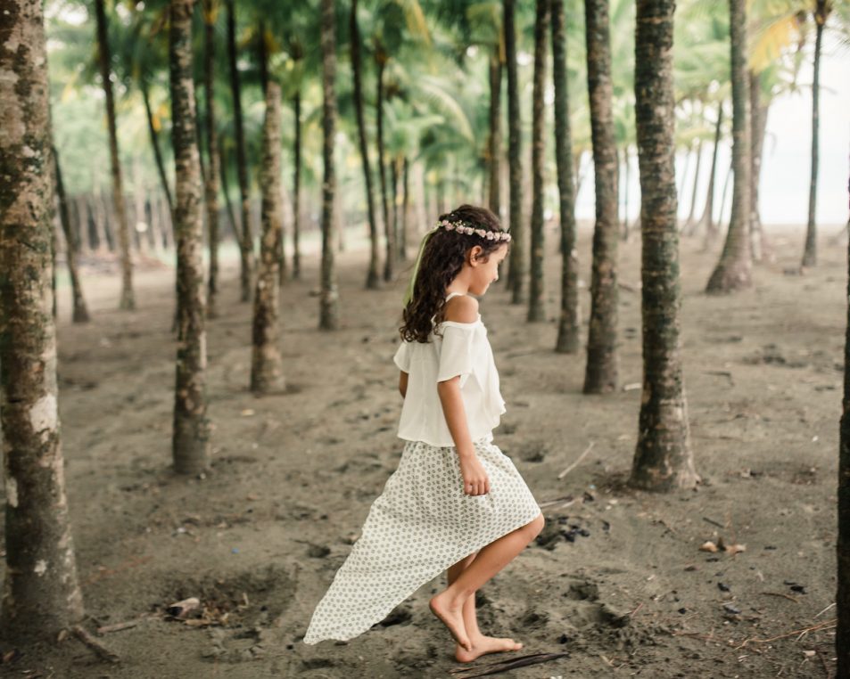
I photographed an awesome Costa Rica-based photographer named Madison Baltodano and her family on a rainy day at the beach with lots of soft filtered light close to sunset.
I personally wanted the photos to look as close to my own style as possible (which is warmer and more contrasty), so I tweaked a few of the Fuji 400H film presets I own to create the images in the collection below. I also cropped my images at the aspect ratio of 4:5, which is more square than the rectangular 3:2 aspect ratio that is produced by our digital cameras.


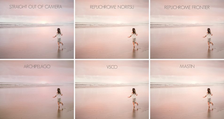
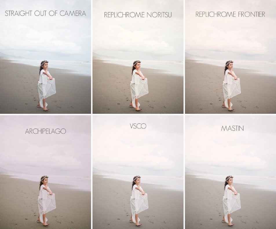
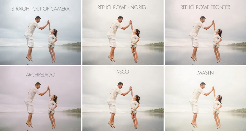
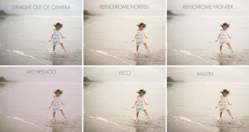
PRESET COMPARISON
To keep things simple for the video tutorial, I chose to show you how some of the more popular presets look when we apply a Fuji 400H film treatment to get a more soft-and-airy pastel look to the photos. If you’re more into a dark-and-moody film look then the Kodak Portra preset collections might work better for you.
To ensure consistency, I didn’t tweak any of these presets. I simply applied them directly to the image and exported. I usually tweak my images a bit more, but I wanted to share exactly what the preset does to each image.
TRIBE ARCHIPELAGO LX-C-01-C
The Archipeligo presets don’t replicate any one film so I chose the one that closest resembled the soft, pastel look of Fuji 400H, which was the LX-C-01-C.
TOTALLY RAD REPLICHROME
The Replichrome presets are unique in that Totally Rad actually based each individual film preset off two of the more common film scanners: Noritsu and Frontier. The results can be quite different between the two scanners.
VSCO FILM PACK 01 – FUJI 400H
Arguably the most popular film presets on the market.
MASTIN LABS FUJI PRO
These presets are designed for photographers who shoot both film and digital at the same time. That way their images will look alike. Settings: Started with 1b Pro 400H Blue, All Soft, 35mm grain (I decided to use the grain settings from each preset so you can see the difference).
OTHER GREAT RESOURCES
I find everything Johnny Patience writes about this stuff incredibly helpful! www.johnnypatience.com/